Finessing Files in InDesign: Adding GREP No Break to Paragraph Style

Widows, Orphans, and Runts, Oh My!

It has been my experience that nothing (except maybe bad kerning or poor font choice) makes an art director grab for a red pen like finding paragraph runts in text. A runt is a very short word or phrase that sits by itself in the last line of a paragraph. In previous posts we discussed the benefits of using a Nonbreaking Space and a No Break Character Style to help finesse your text flow.

But wouldn’t it be grand if you could actually prevent most bad breaks from occurring at all?

While these tools make it easier to control how your text flows, they will not save much proofing time on your part because you will still have to read the text to spot bad breaks and then manually apply these options to correct them. Wouldn’t it be grand if you could actually prevent most bad breaks from occurring at all? You can! With the power of GREP.

Continue reading Finessing Files in InDesign: Adding GREP No Break to Paragraph Style
Finessing Files in InDesign: No Break

Give Me a Break–Not!

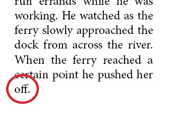
This paragraph contains a runt (single word) on the last line.

In the last Finessing Files-related post, I discussed uses of the Nonbreaking Space. It is a quick and easy way to prevent text from breaking at awkward spaces. But InDesign also provides a No Break option that unites the words you have highlighted and does not allow them to break at the end of a line. You can access it in a number of ways. The illustrated paragraph contains a single word on the last line. As a production artist, you could let it be, or you could spare your art director from having heart palpitations by correcting it at this stage.

Continue reading Finessing Files in InDesign: No Break

Finessing Files in InDesign: Nonbreaking Space

Sometimes You Need a Break; Sometimes You Don’t

Spaces are often taken for granted. They are thought of simply as the delimiter of words in a sentence. But spaces are powerful. For instance, the days of putting two spaces between sentences are long gone, but the need for that space equivalent is still here. In fact, there are now more types of spaces available than most people have ever thought of: em spaces, en spaces, thin spaces, figure spaces, and more. Today I am contemplating the nonbreaking space.

Continue reading Finessing Files in InDesign: Nonbreaking Space

Finessing Files in InDesign

It is fun to find talented designers/layout artists and guide their hands as they work in InDesign. It is also interesting to hear their questions. I have worked at typesetting/desktop publishing for so many years that I do certain tasks as a matter of course, keeping in mind that an extra hour spent at the beginning will save precious minutes over the course of a series of books, or even during the edit phase of a project.

So, the next few blog entries will feature ways to create smarter styles so that text reflow in the editing phase of a project will go more smoothly. You will find discussions about times to use a Nonbreaking Space, how to set up a No Break Character Style, and even a very shallow discussion about Using GREP to Control Bad Breaks before they crop up. I hope you find some of these tips useful.

Playing in the Cloud … the Adobe Cloud.

Be careful what you share in groups … you may have to demonstrate what you know.

The other day I made a comment on my local Adobe user group site that I was playing around with Muse, that I liked the interface, that it reminded me of InDesign, that it was easy to use, blah blah blah.

They said, “Wow, great, could you demonstrate it to us?”

“Erm …”

Be careful what you share … you may have to demonstrate what you know (or don’t know!)

So, I did what any red-blooded newby Muse-user would do and I said, “Sure.”

Now here’s the thing: I am not an expert Muse-user. I am barely a beginner Muse-user. So, am I really qualified to demonstrate to my user group what I know?

Continue reading Playing in the Cloud … the Adobe Cloud.