Give Me a Break–Not!

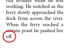
In the last Finessing Files-related post, I discussed uses of the Nonbreaking Space. It is a quick and easy way to prevent text from breaking at awkward spaces. But InDesign also provides a No Break option that unites the words you have highlighted and does not allow them to break at the end of a line. You can access it in a number of ways. The illustrated paragraph contains a single word on the last line. As a production artist, you could let it be, or you could spare your art director from having heart palpitations by correcting it at this stage.
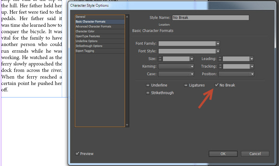
You can create a Character Style that features the No Break option. The illustration shows where you can find the No Break option in the Character Style menu.

Surprisingly, many designers have not noticed this option for character styles, even though it is at the first level of options. It is always fun to try out each option in a menu just to see what each can do. Pick a slow day and play with the various style options.

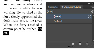
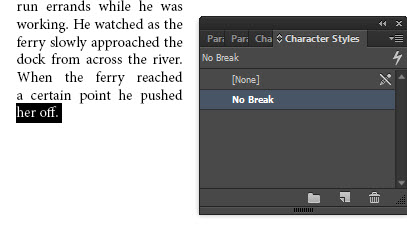
It is easy to apply. Just highlight the last two (or three if they are small words) words that you want to stay together and apply the No Break Character Style. Your paragraph should re-wrap and your unsightly break should be taken care of.

You may not only want to apply No Break to runt text you find at the end of graphs. You may find it helpful to prevent unsightly stacks in paragraphs as well. As you can see in the paragraph illustrated here, there is a stack of the word “the” on the right side of the paragraph. You could highlight the last “the” and the word that follows it and apply No Break to those words as well. This will keep those words together when the paragraph re-wraps.
Why do you need to use a character style at all? Why can’t you just force a break somewhere and go on with styling the text?
Why do you need to use a character style at all? Why not just force a break somewhere and go on with styling the text? In a perfect world this would work fine, but in my production world it can’t be tolerated. Let’s say that the art director or client or brand manager decides to use a different font or a different point size. This could cause a re-wrap and your hard break will cause its own problems with text in the next iteration. Or, the text could be reused as a pull quote in the chapter and given an entirely different text treatment. By using the invisible No Break Character Style, at least you will be certain that your text will always stay together no matter what goes on with the overarching paragraph style.
The final post in this series will discuss using GREP to incorporate the No Break Character Style into your Paragraph Styles so that these unsightly breaks will quietly be taken care of in the background and you will not have to worry about it once your paragraph style is applied.