A Digital World Demands Interactive Media
Designing for devices becomes a puzzle of what to animate and why. I’ve been experimenting with different website layouts (using Adobe Muse, mostly) as well as using Adobe DPS (Digital Publishing System) for redefining printed matter to use on a tablet. It’s been a fun experiment.
I’ve found that less is more when it comes to animations so I’ve tried to pare pages down to their basics. I enjoy the possibilities afforded by interactive pages.
One of my clients is a volleyball club here in the Puget Sound region. I have been putting their yearbooks together for many years, but once I got an iPad in my hands, I knew that the yearbook format was perfect for an interactive device. Here’s an example of how I rethought the pages so that they work better as an interactive format.
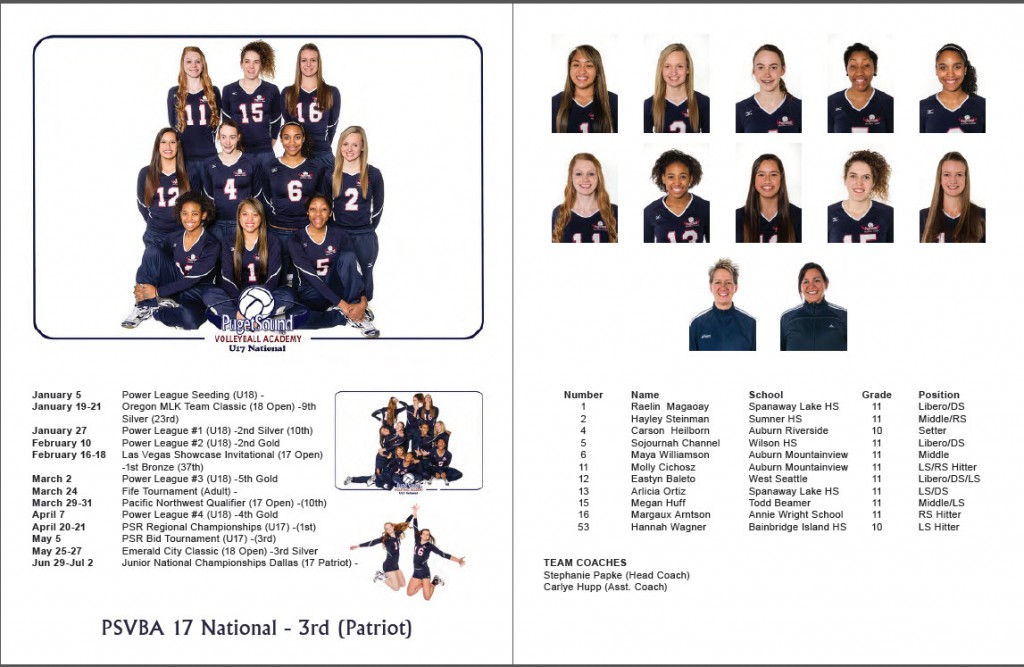
This is a typical spread for a team. The team photo is on the upper left with the season results listed below. On the facing page are the individual pictures followed by their roster. It is a pretty basic layout and you might even wonder why I thought that this would work in an interactive form.
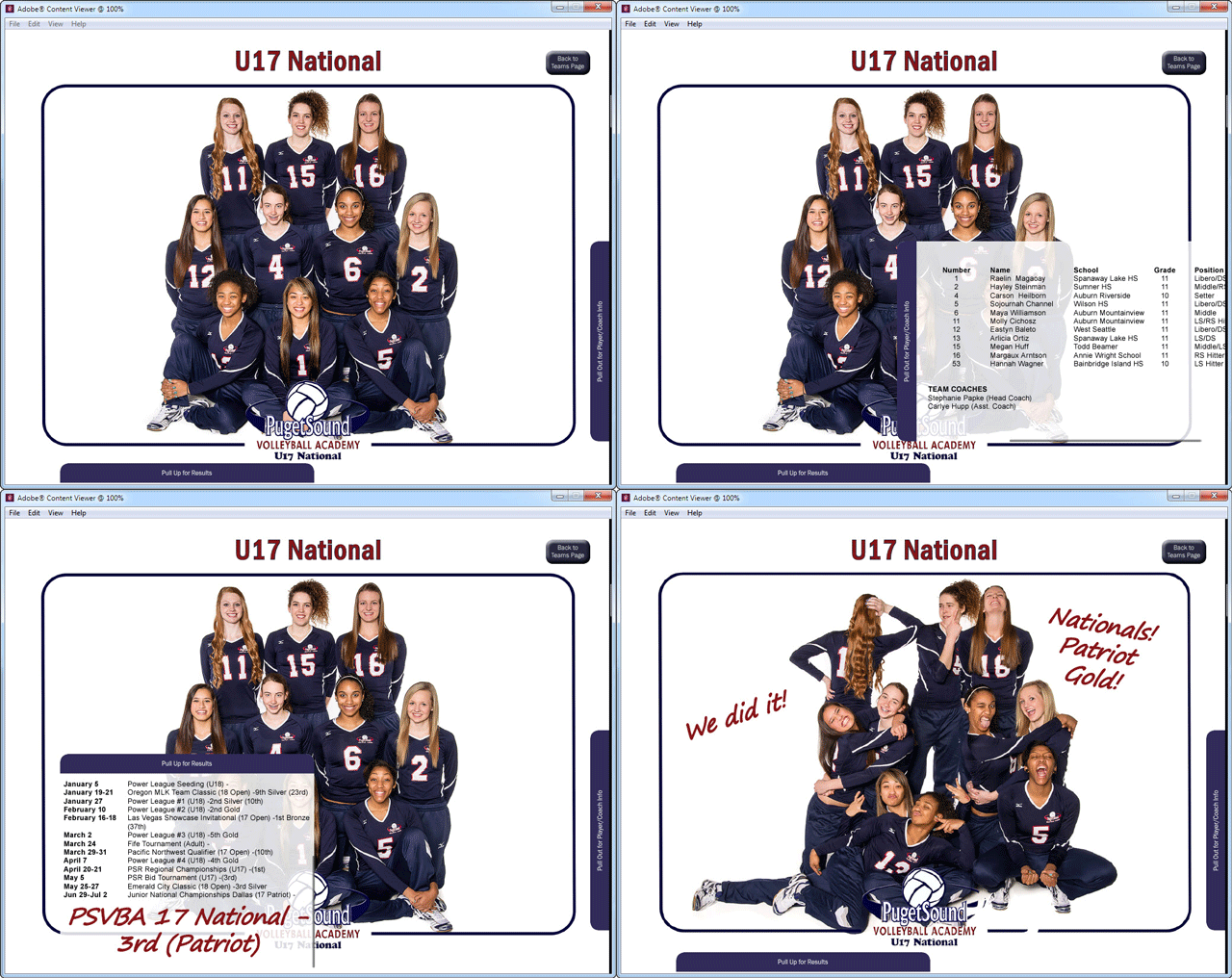
I broke the spread into its basic elements: the team photo, the roster, the results, and the individual shots. I decided that the individual shots were no longer necessary because the team shot on the iPad could be enlarged by pinching it open and each girl could be viewed more closely just by enlarging the team view, so I made the team view the base image of the page screen.
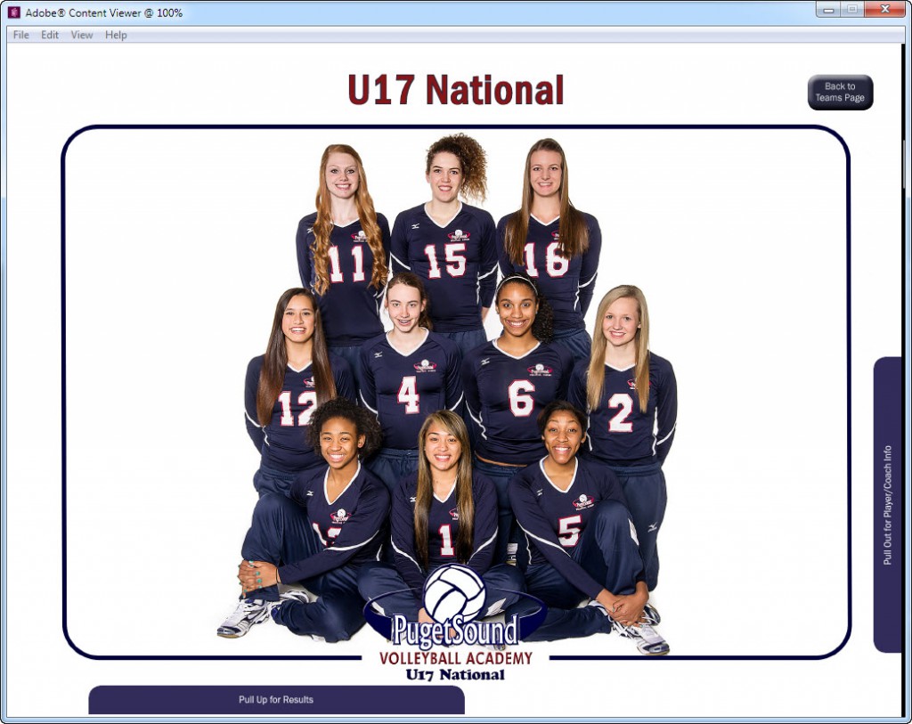
Next I thought about how to present the roster and results in a way that would make sense. I gave some thought to putting invisible buttons on each girl’s face so that touching her face would open a window with her roster information, but this became problematic because trying to enlarge the image onscreen inadvertently opened these info windows. I decided, instead, to use “pull-to-view” windows which the viewer could activate on his own.
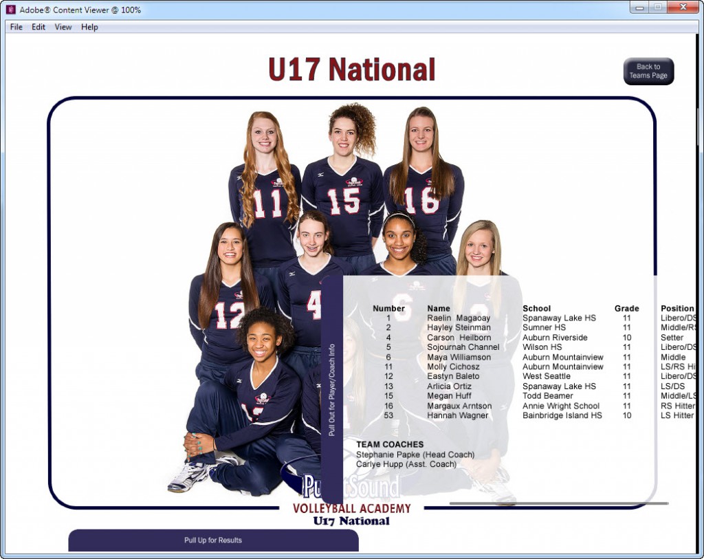
The roster window background is translucent so that you can still see the individual faces and numbers on the image behind it even when the window is pulled out. The team results are activated by pulling up the window at the bottom of the screen.
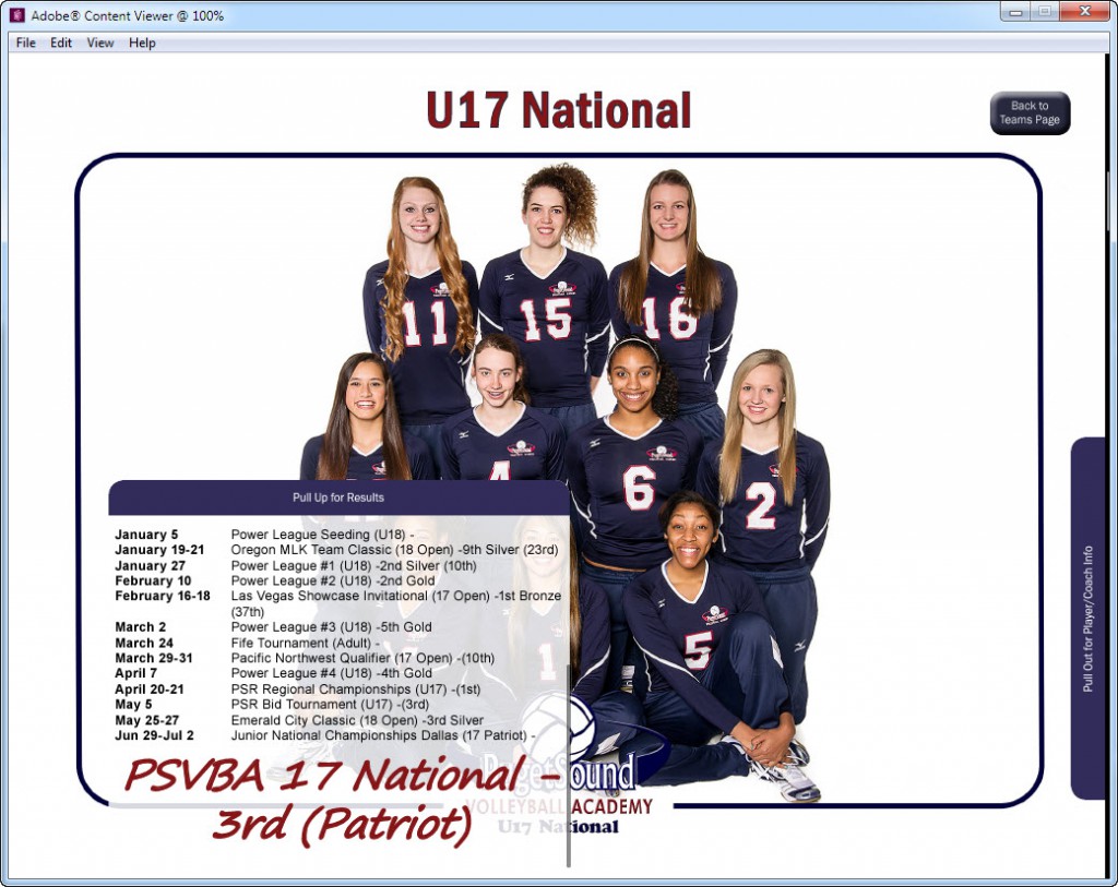
This one screen now holds the same information that it took two printed pages to hold in the traditional yearbook. Because the team made it to Nationals, I thought I’d add an Easter Egg to the screen. So I made an interactive object using the team’s fun photo and their basic team shot. The fun photo could be activated by wiping across the screen. The team may or may not find the bonus shot, but that’s half the fun of an interactive experience. Here’s the team’s fun photo.
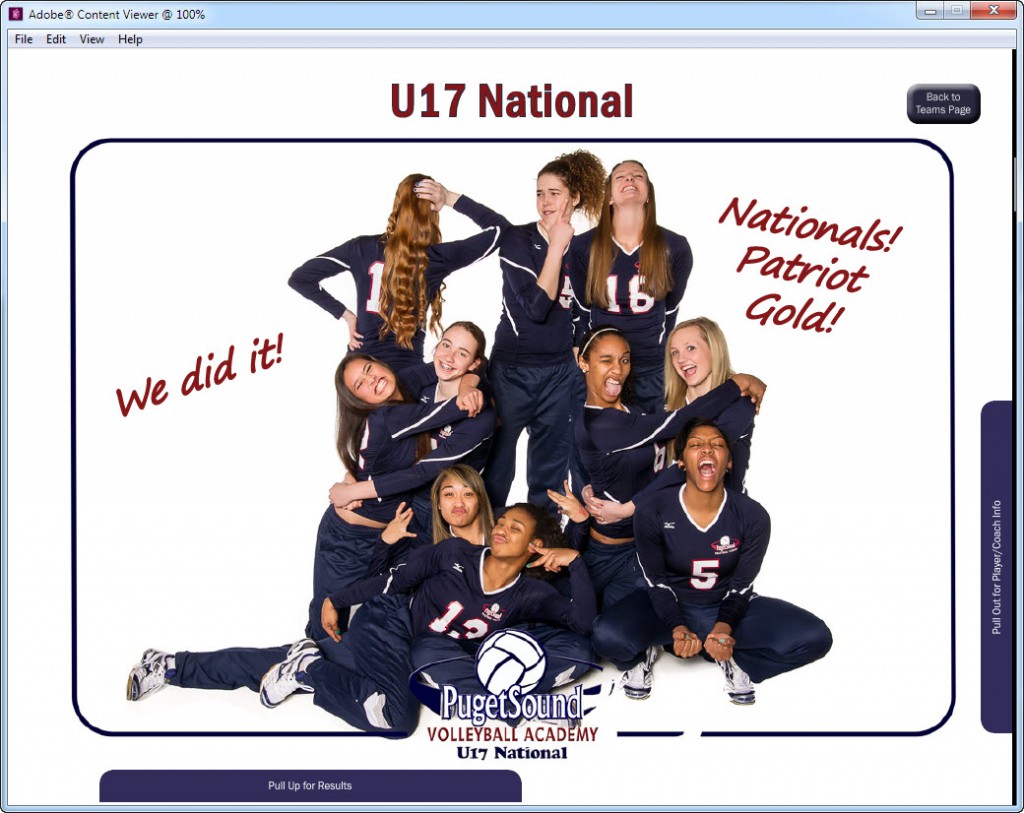
I combined all that interactivity together on one screen. Was it necessary? Maybe not, but it is much more interesting and far more compact now that I’ve recreated the book this way. And, had I not re-imagined the book with these interactive elements it would just be a PDF viewed on an iPad.
Here’s how the printed spread first shown above now works on an iPad.
Here’s something I’ve noticed quite a bit lately: When I’m reading a book on a digital device I find my fingers busily searching the page for something to interact with. It’s as though they have a life of their own. This didn’t happen even a year ago. Blame it on the smart phone in my hand or the iPad mini in my purse, but these fingers are itching to trigger some sort of reaction.
I think that the yearbook app I created is much more fun than the printed version. It gives the viewer something to tap on, to trigger, to discover. And, as a bonus to the advertisers, each ad opens to their website when tapped, so they get a better user experience as well. I have enjoyed experimenting with these interactive apps and I will miss having access to DPS with my individual Creative Cloud account, but I am also looking forward to creating some interesting fixed layout epubs. With luck, you will be reading about those in another installment.
You can still find these apps on the App Store. Here’s a link to the 2014 version. Enjoy!